
Prelude to Foundation
book cover
Foundation was on my bookshelf as a teen, I think I even started it a few times, but it didn’t really stick back then. A few years ago I came across an audiobook version of Prelude to Foundation, I was instantly hooked. I guess I needed to know more about the past of Sheldon to find the story interesting.
My teen self’s lack of interest however is only a testament to how important characters and their personal development in a story were to me even back then. It is not in any way a negative criticism of the Foundation itself. Please don’t come at me nerds, we are on the same side here. I was knee-deep in science fiction, reading Sergey Snegov’s Humans as Gods (that cover is still haunting me) and watching Stargate and Firefly on tv.
The idea to make a cover for this book came to me when I came across the trilogy’s new Hungarian translation by Gabo publishing house, which had this epic cover with a giant spaceship in the vastness of space. I loved that edition, so much so that I bought it immediately. I am all into this aesthetic modernisation of classics, but I also love the nostalgia of the old covers. To me seeing characters on covers are always way more exciting than having a cover that has no meaningful connection to the story, even if it is very pretty. While I am reading a book I tend to just close the book sometimes and take a long look at the cover, to see what the characters in the front are. I love to think about how they feel, what they might think, and how would they act throughout the book. So a cover like this just makes more sense to me.
The three main characters of Prelude to Foundation are Hari Sheldon, Dors Venabili (in the forefront) and Eto Demerzel (in the background) so they occupy the best half of the cover. Besides them, the only element that is in focus is some weird tower-like structures in the background. That is a place on Trantor (where the book takes place) called Dahl district, which main features are the heat-sinks, which are a sort of energy source for the Empire. Dahl is one of the main if not the most important location for the plot, and I somehow was drawn to the idea that this fictional place has the aesthetics of computer heatsinks.
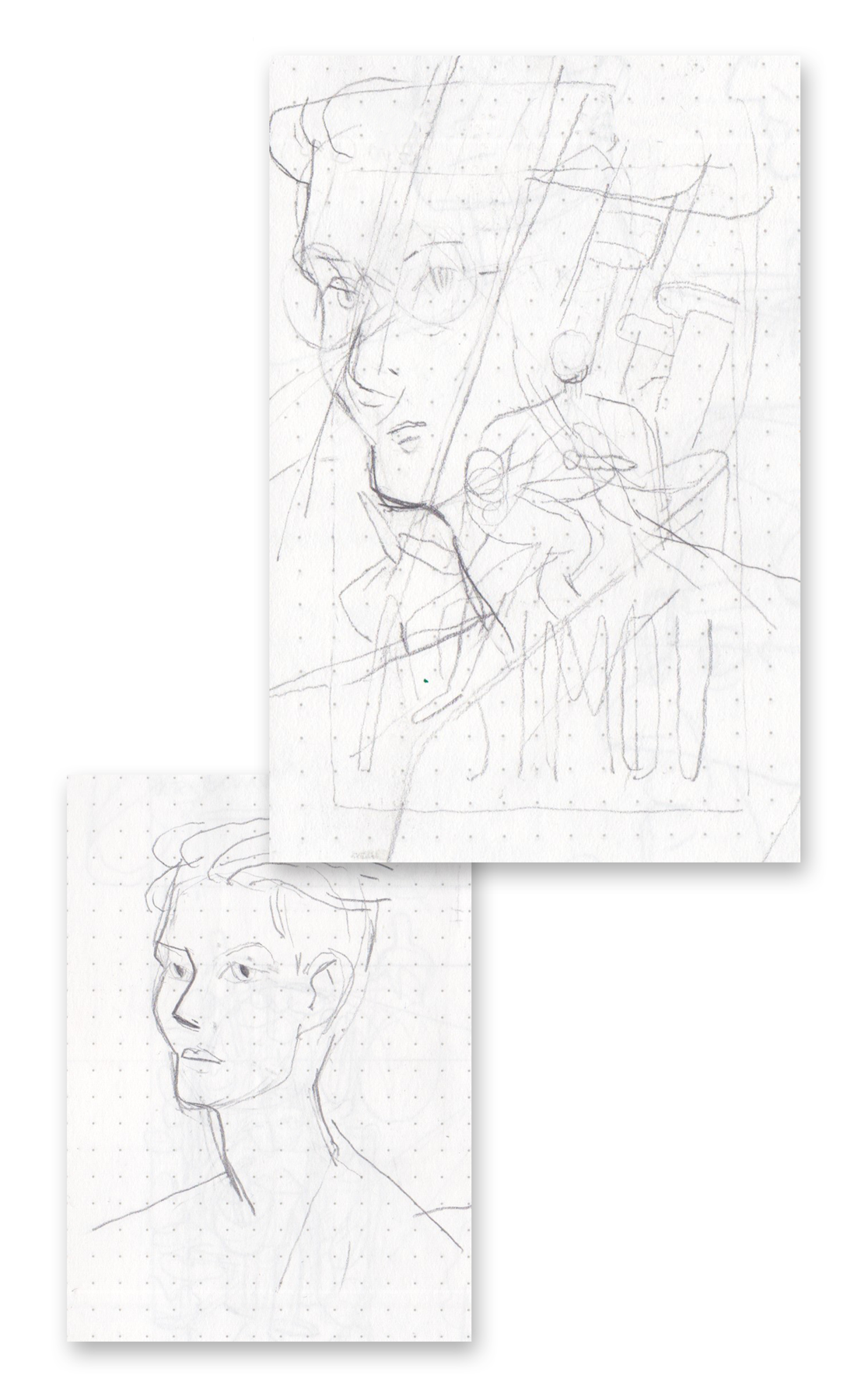

My initial concept for this cover was to create this multi-layered scene that invokes the characters’ progress through the story, while they are also entering the various levels of Trantor. Reading the book felt like entering Sheldon’s mind, like unfolding an old memory, one step at a time. It has this peculiar feeling to it as if you’d known what is going to happen at the end, even from the first page. I guess it is because so many movies since then were built on these classic science fiction books, so by now we –the viewers– have become familiar with every twist and turn.
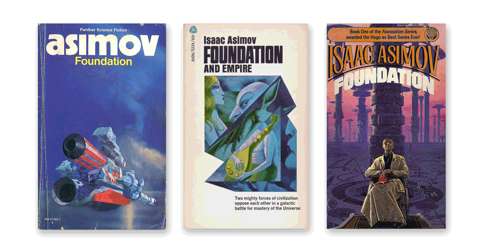
The Asimov typography was inspired by this old cover by Chris Foss from the ’70s. I honestly think it is perfect. For the title, I wanted a clean, modern, sans serif font that still has some sci-fi nostalgia vibe to it, and the font I landed on was Lugati by Leonit Gashi.
